Case study.
Walmart
Complex component construction
When multiple teams create similar but diverging patterns, the result is design and tech debt. This Filter Panel is one of the complex but flexible organism-level components I created for a pattern library that extends Walmart's core design system. When complex components are built with design tokens and strict system standards, they're more consistent, reusable, and easier for engineers to assemble.
Summary.
Please note! This is a brief summary of my work. I'd be happy to present a more detailed case study at your convenience! grgsmthdsn@gmail.com
The implementation of this Filter Panel component demonstrates:
- My approach to complex, product-specific components.
- Adherence to design system and Figma best practices, to deliver familiar, reliable components that uphold the visual brand.
- How I consider A11y standards and engineering deliverables in my design system work.
⏰ Duration
Part of the PX Pattern Library project displayed in the previous case study.
🧰 Team
- 1 Senior design director
- 1 Design director
- 1 Design system SME
- 1 Accessibility SME
- 1 Product design lead
- 2 Senior designers
🤓 My role
Design system SME
Build the Filter Panel component, with robust customization options. Write engineering specifications. Collaborate with engineers on component QA (in Storybook).
⏰ Duration
🧰 Team
🤓 My role
Part of the PX Pattern Library project displayed in the previous case study.
- 1 Senior design director
- 1 Design director
- 1 Design system SME
- 1 Accessibility SME
- 1 Product design lead
- 2 Senior designers
Design system SME
Build the Filter Panel component, with robust customization options. Write engineering specifications. Collaborate with engineers on component QA (in Storybook).
Challenge.
Multiple teams throughout Walmart's Enterprise business pillar had been building and maintaining their own Filter Panel components. This creates:
- Visual inconsistency.
- Unique designer experience for each component, as there’s no adherence to the design system team’s standards.
- Time wasted on the upkeep and iteration of multiple variations.
- Confusion and time wasted when designers are seeking support, uncertain of source-of-truth ownership.
- Wasted engineering effort, where multiple teams are working to build a component that should be unified, under the ownership of a single team.
Solution.
- Audit existing variations of Filter Panel components.
- Collaborate with feature design teams to align on necessary features.
- Design a POC, and review (before completing hi-fidelity work) with:
- Pattern library team, including design director for approval.
- Accessibility partner, to ensure WCAG compliance.
- Engineering partners, to discuss future implementation.
- Build component sets in a library branch.
- Extensive testing with select enterprise designers.
- Publish the component set as an addition to the ongoing library work.
Work samples.
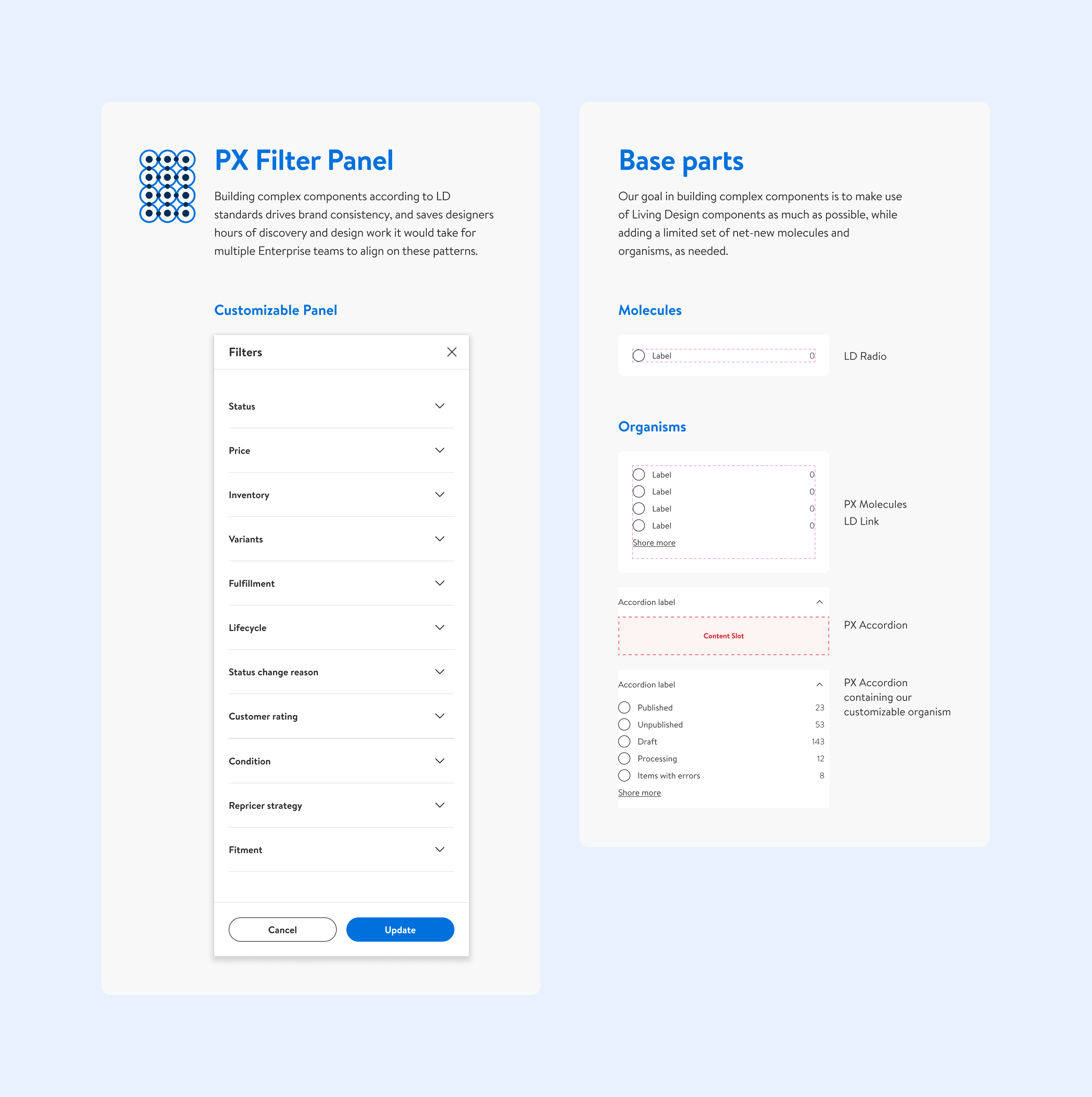
👆🏼 This is a screen I used to demonstrate the POC for the new Filter Panel to design leadership, accessibility partners, and engineering partners. One of the primary goals was to show how the component:
- Is built with the core design system’s tokens and foundations.
- Uses a pre-existing Panel component & and atoms from the core design system, reducing engineering effort.
- Can be customized by designers to display a finite set of filter types.
- Meets A11y standards for things like color contrast and target spacing.
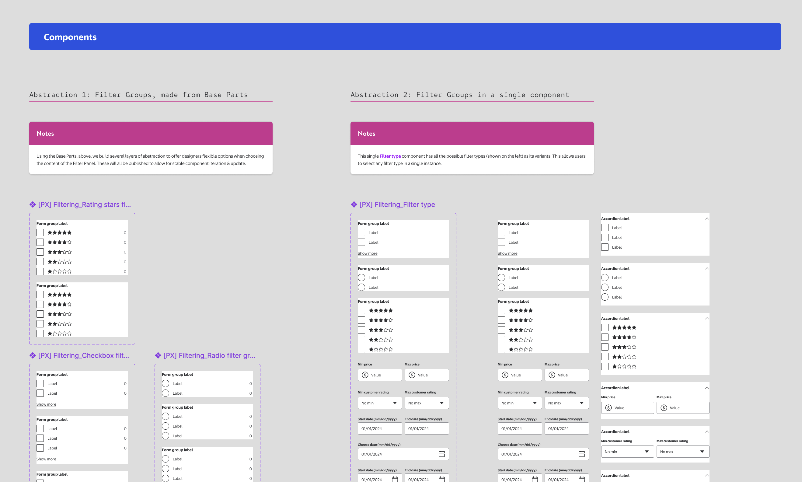
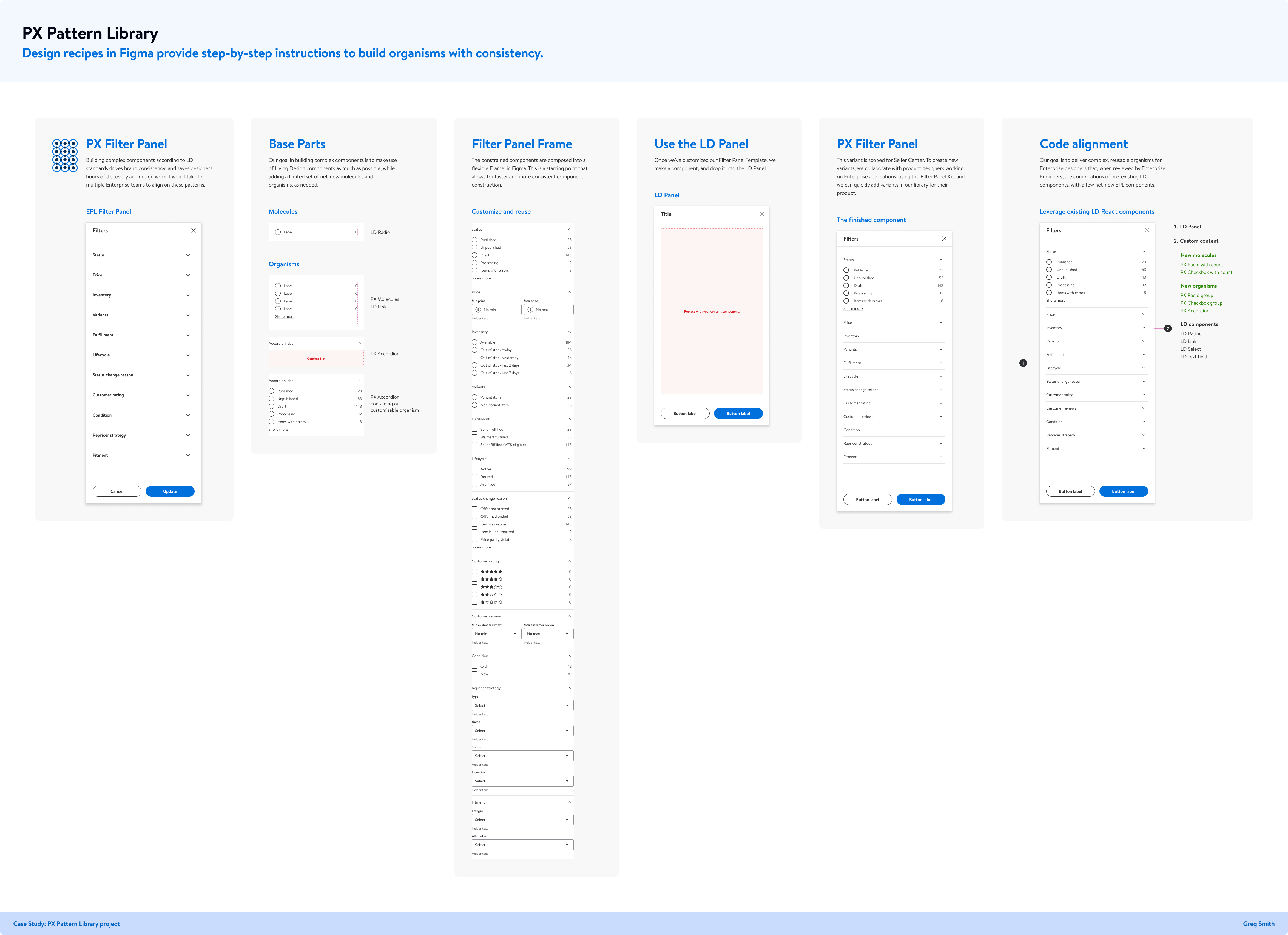
👆🏼 This is a portion of the component set, in the library. It's built and documented so that other members of the pattern library team can:
- Understand its construction, and assemble new filter type sub-components when iteration is necessary.
- Manage the component properties that designers see and customize in Figma.
Key takeaways.
Unifying a complex and widely used component like the Filter Panel allowed us to remove multiple existing variations. Considering the scale of Walmart, the amount of hours saved, and the amount of design and tech debt removed, equated to massive cost savings.
Complex components in Figma need to be considered very carefully. Friction in the designer experience increases exponentially with complexity. We need to build them with strict adherence to the core design system (always using the correct tokens and foundations) for brand and experience consistency.
Get in touch.
I welcome the opportunity to discuss this project in more detail, as well as more of my design system work! grgsmthdsn@gmail.com