Case study.
Walmart
Incorporating native mobile patterns
Our design system team needed to pivot from a platform agnostic approach to all components and patterns, and help users implement existing native mobile patterns. The test case would be a component set of date pickers and calendars. I compared existing system offerings to native offerings, collaborated with native engineers to understand the best approaches, and created components and documentation to guide product teams.
Summary.
Please note! This is a brief summary of my work. I'd be happy to present a more detailed case study at your convenience! grgsmthdsn@gmail.com
The primary goal of this effort was to address engineering pain-points in the development and implementation of native mobile patterns.
My approach was to:
- Collaborate with iOS and Android engineers to understand the impact of requiring custom date picker & calendar patterns.
- Up to this point, the design system team had been required to prioritize a consistent brand experience, per platform, over existing native patterns.
- Audit current, existing native patterns that could be used instead.
- Clarify the pros/cons/impact of allowing our native engineers to pivot strategy.
- Propose solutions for designers to use and customize native components and patterns available in the Figma Community.
- Propose an update to our documented guidelines.
⏰ Duration
Two sprint cycles
🧰 Team
- 1 Design director
- 4 UX designers
- 2 React engineers
- 1 iOS engineer
- 1 Android engineer
- 1 Accessibility SME
🤓 My role
Senior UX Designer
Conduct research & audits, propose design solutions, collaborate with engineers and accessibility partners, write updated documentation.
⏰ Duration
🧰 Team
🤓 My role
Two sprint cycles
- 1 Design director
- 4 UX designers
- 2 React engineers
- 1 iOS engineer
- 1 Android engineer
- 1 Accessibility SME
Senior UX Designer
Conduct research & audits, propose design solutions, collaborate with engineers and accessibility partners, write updated documentation.
Impact.
I was able to convince the team to pivot from our previous strategy and allow the design system to recommend and support the use of existing native patterns. Several iOS and Android engineering tickets were removed from our backlog that would have spanned multiple sprint cycles.
Challenge.
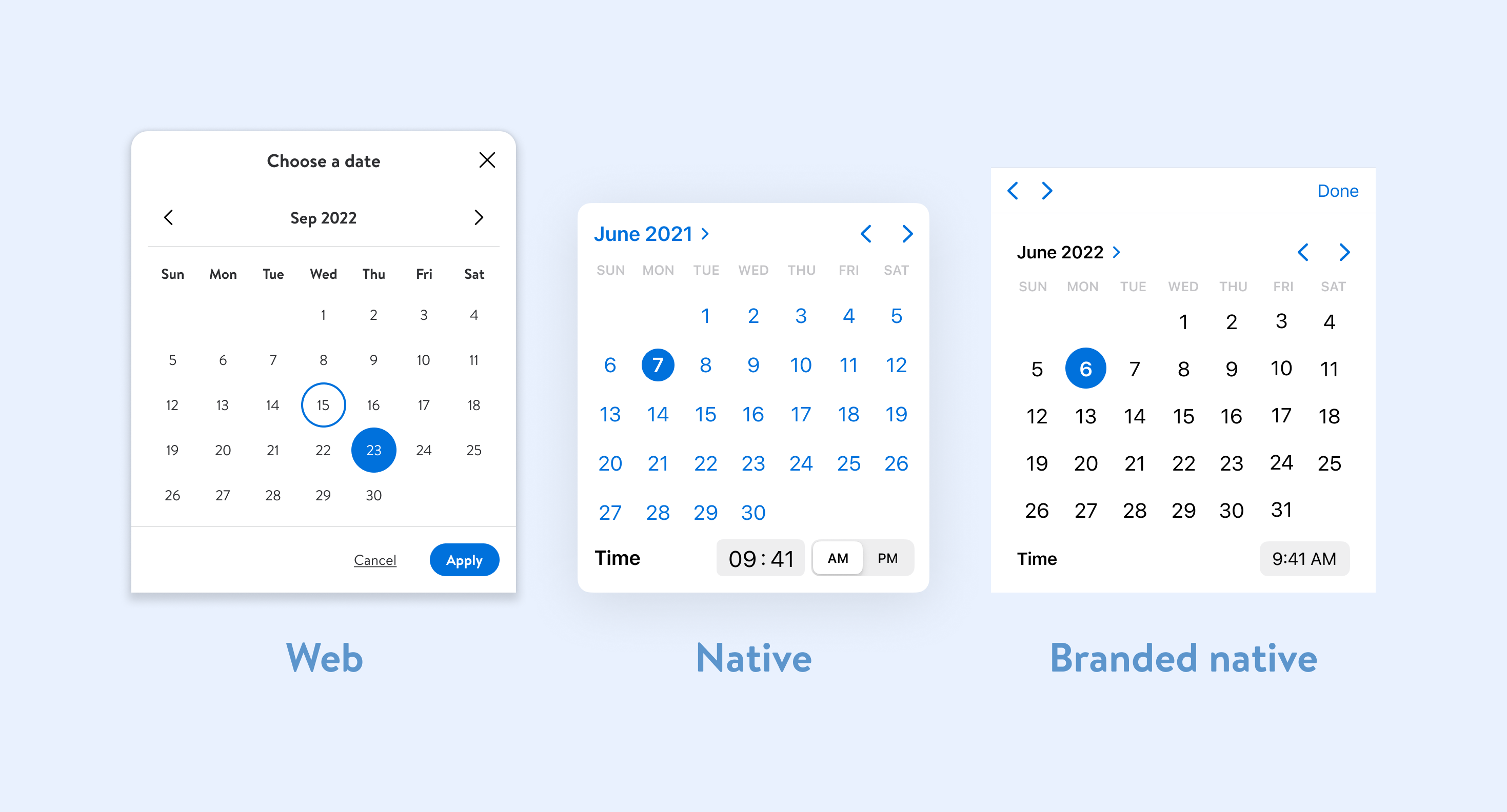
The initial requirements for our set of Date Picker components included driving a consistent, branded experience on all platforms: desktop web, mobile web, and native (iOS and Android).
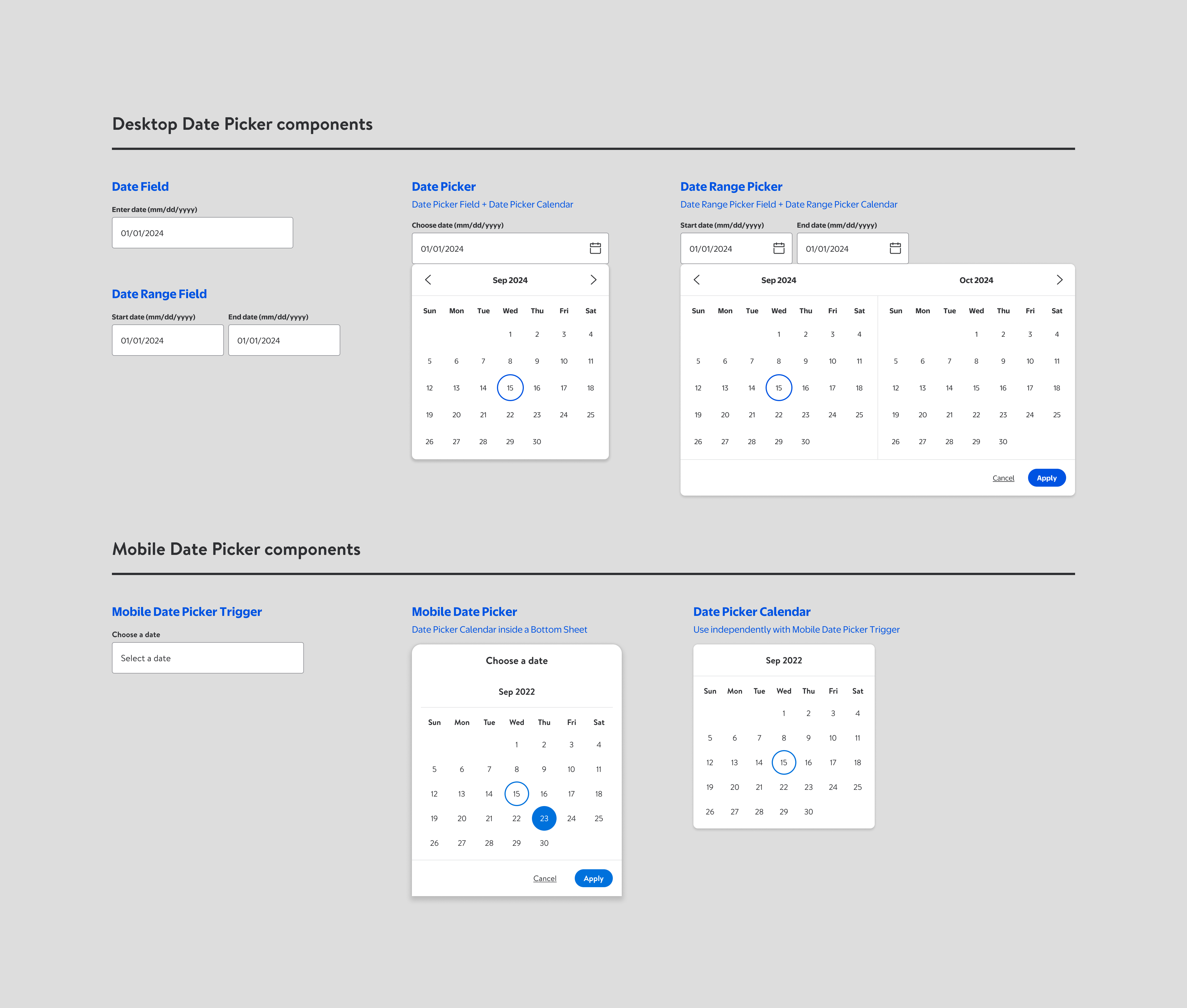
- I had completed a large set of Figma components, and they were in a beta state for select design users, to collect feedback.
- React engineering effort had started.
- The tickets for native engineering were still in our backlog.
We were hearing uniform feedback from designers that the singular mobile implementation felt like imposing a mobile web experience the native platforms.
Opportunity.
The consistent feedback we were getting was that native users expect a native experience. There was a clear opportunity to pivot from our previous strategy, and reduce the lift required to ignore those existing solutions and favor custom components.
Solution.
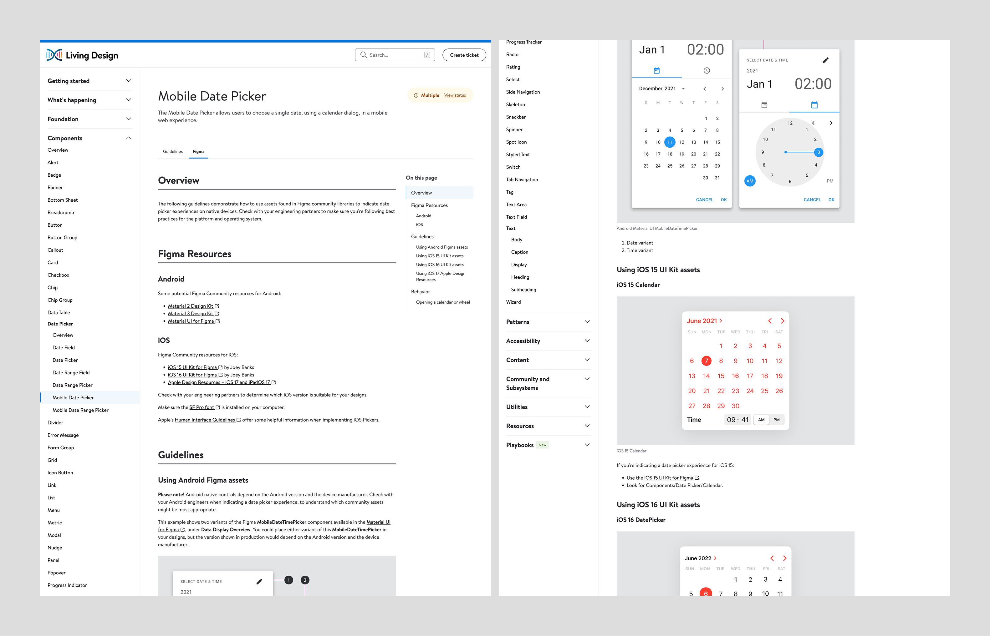
My first step was to collect a basic audit of existing native date picker components available in Figma community libraries. These would serve as starting point for discussion with native system engineers.
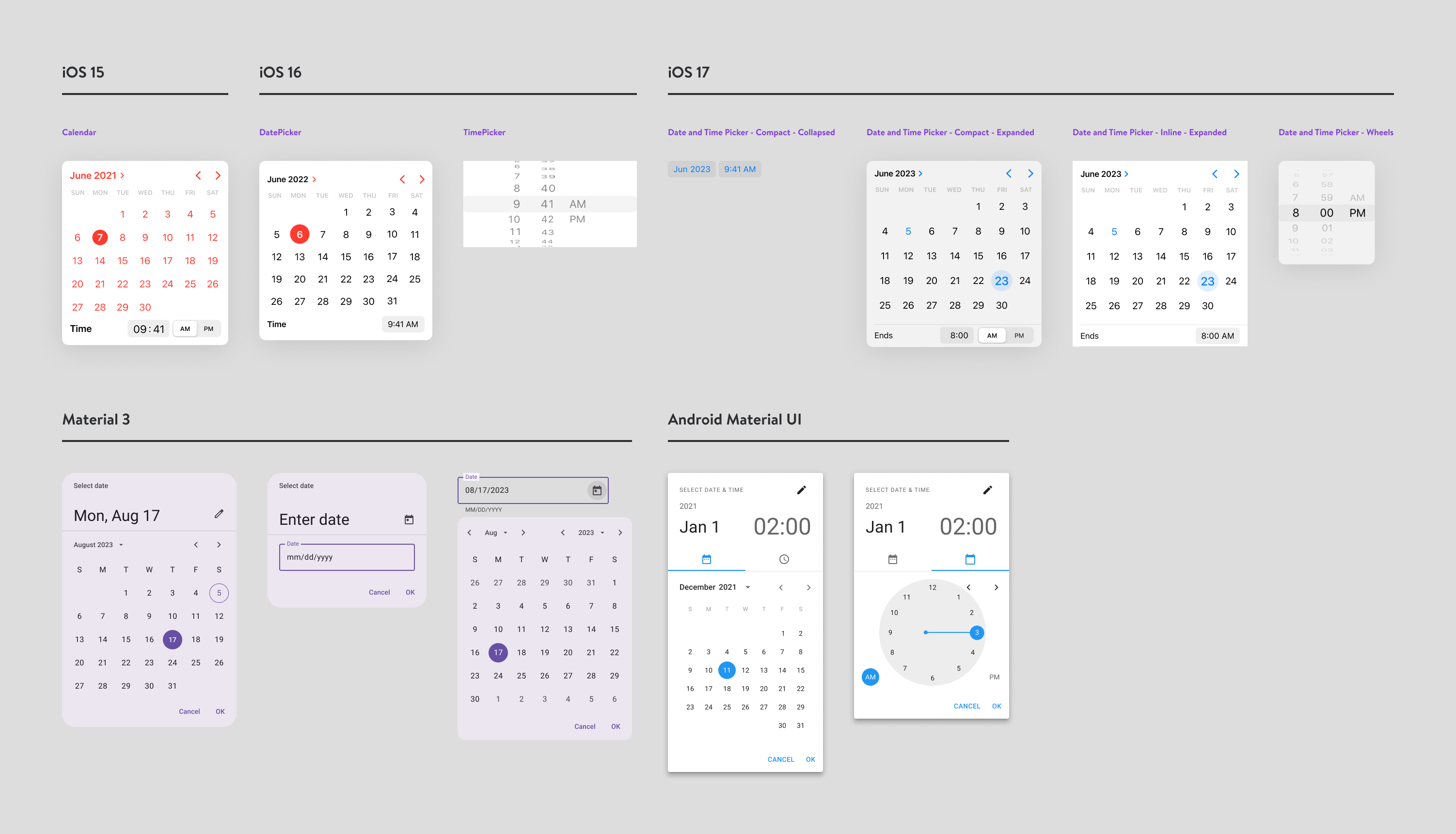
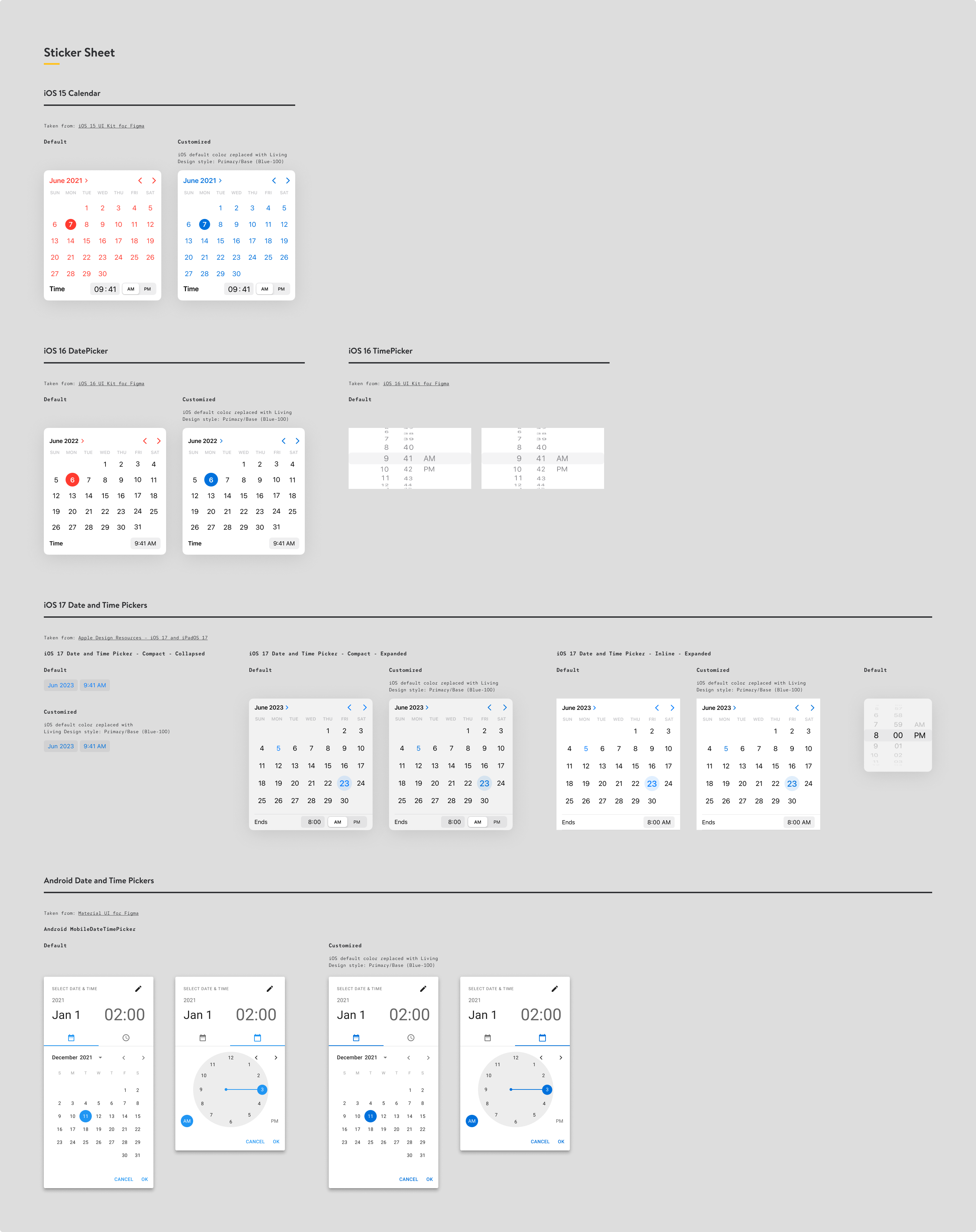
My next step was to assemble a sticker sheet of usable component instances, where I'd customized the element's colors with Living Design styles, for brand consistency.
Learnings.
The solutions for iOS were easier to implement, and they were easier to govern, for design users. There was often more of a one-to-one replacement for our web-biased patterns. Android solutions were a bit more subjective, as the UI can be device-dependant.
In the end, we found that offering a sticker sheet of customized native components was a small lift for the design system team, and a helpful asset for designers. This, along with some formal documentation, served as a good starting point that would save designers time, and give them a conversation point with their engineering partners. The time savings for iOS and Android engineers was the biggest win.
Get in touch.
I welcome the opportunity to discuss this project in more detail, as well as more of my design system work! grgsmthdsn@gmail.com